I finished this quilt last fall, for my husband, Ty.
It is very personalized, and quickly became one of my favorites while designing it!
I hoarded many different fabrics before beginning this quilt, so many in fact, I was tempted to enter it in the 'scrappy' category.
 |
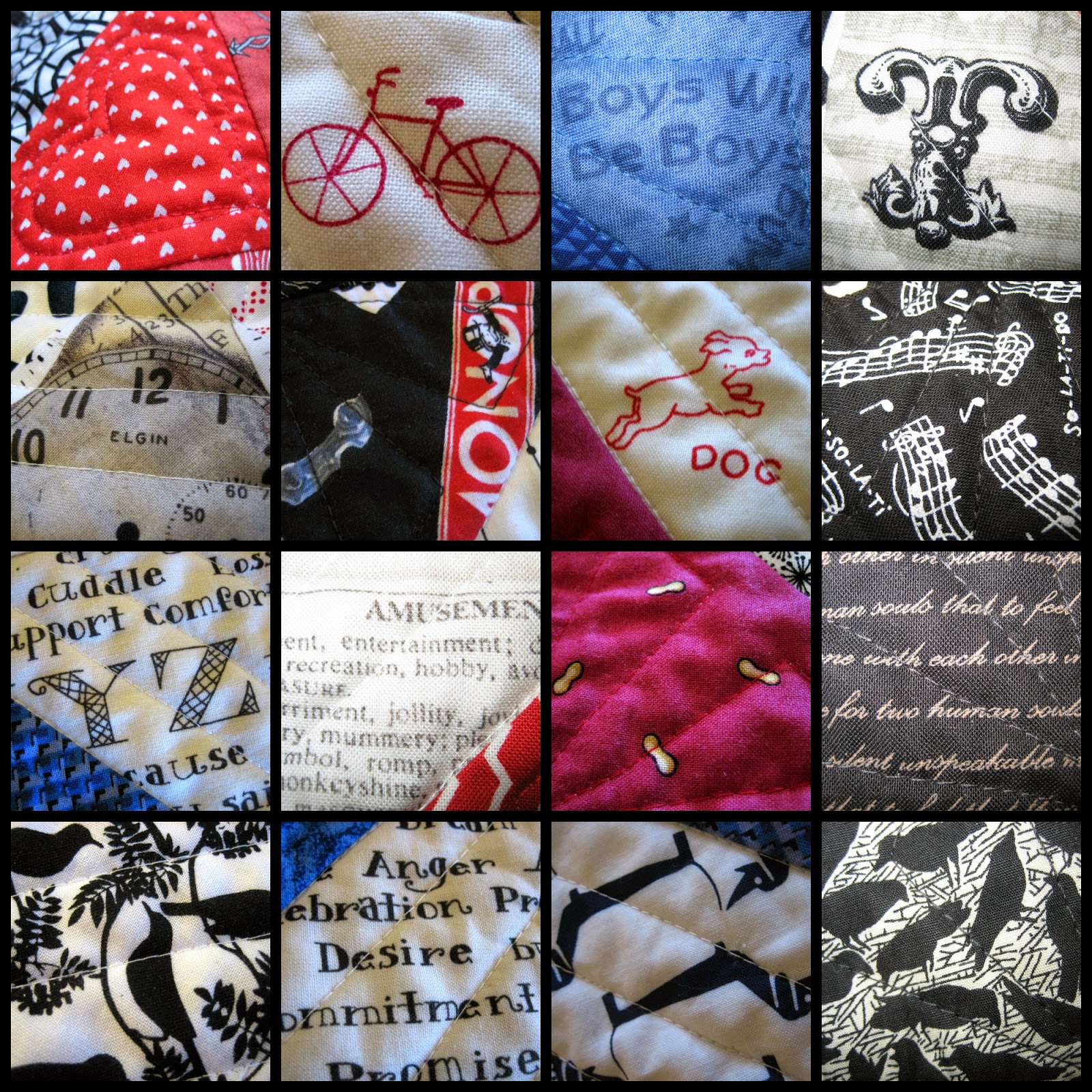
| Things Ty Likes, (plus a few sentimental bits I snuck in!) |
I am proud of the original design that Ty and I developed together in EQ6, so even though this is quite scrappy, you will find it entered in the 'Original Design' category! I hope you will visit the link, and take the time to vote for your favorites!
Here is the first sketch, before we added another row, and before we had decided on color placement:
I do love EQ6! I am so late to update to EQ7, I am hoping that EQ8 comes out soon so I can just skip it! I played with scrappy fabric placements, to better visualize the 'real' result:
If you are interested in the pattern, you have our permission to make one of your own:-) I would consider it quite a compliment, and would appreciate any credits if you do, and I would love to see your work as well! I used 5" squares, so it would be easy to adapt this with charm packs!
Thank you so much for reading! I hope you enjoy the show over at Amy's Creative Side!
Voting begins May23rd!!
POST UPDATE, January 2015!
I was thrilled to recently receive an email from Romana Černá, from Prague, Czech Republic. She was inspired by Ty's quilt and shared this photo of her version!
I am so glad she shared this, it is so beautiful!
POST UPDATE, January 2015!
I was thrilled to recently receive an email from Romana Černá, from Prague, Czech Republic. She was inspired by Ty's quilt and shared this photo of her version!
I am so glad she shared this, it is so beautiful!


This is such a cool quilt. I love the twist of the zigzags shooting off.
ReplyDeleteI love the design. Great quilt.
ReplyDeleteThis is such a great quilt!! Such a wonderful fresh use of HSTs.I like that you and your husband designed it together. Thanks for showing close ups of the fabrics, it's a great mix.
ReplyDeleteGreat design. I like the use of different reds (blues, blacks) to add to the interest and meaning.
ReplyDeleteHeidi, it's awesome! I love that it's like an adult ispy quilt as well as being a great design !
ReplyDeleteAh, I didn't mean "adult" ispy, just, erm, ispy for grownups ????
I love this design!
ReplyDeleteBeautiful quilt! Thank you for sharing the pattern.
ReplyDeleteReally interesting design! It reminds me of chalk drawings on the sidewalk washing off into the rain gutters... Lovely!
ReplyDeleteWhat a cool design! Very striking. And how fun that you made it scrappy too. Great job! I love it!
ReplyDeleteI like it a quilt! Beautifully! Original! Great!
ReplyDeleteit's great! Such a clever use of HSTs!
ReplyDeleteToo bad voting is past; I love this take on chevron and stripe. And I love multifabric quilts. Visiting from Tuesday Archives. Claire aka knitnkwilt
ReplyDeleteI remember seeing the design for this one, and thinking how cool it looked. I don't think I ever saw it finished, though, so I'm glad I came across it now. It looks AWESOME! Great job.
ReplyDeleteI love this! Saving it in my patterns folder. It's a great use for the HST's I have in my scraps. www.quiltartbymegan.com
ReplyDelete